kindara rebrand
TAKE YOUR FERTILITY IN YOUR HANDS
Client: Kindara
Rold: Art Direction/Design
As a top women’s lifestyle brand, bringing in $5.3 million in Venture Capital this year, Kindara has built a brand around women understanding and empowering themselves with knowledge about their bodies. The Guardian may have just wrote a great article about them, they may be a top downloaded app across the women’s lifestyle board in the Apple store, but major competitors creeping in.
“Kindara is one of those rare companies that is truly revolutionizing the world through technology
— Denise Franklin, CEO Kindara
Their user is a 20-40 something female who wants one of three things: either to become pregnant or to avoid pregnancy or to understand more about her body. She is aware of her body and is knowledgeable about traditional forms of hormone birth control or pregnancy assistance. She is modern and aspires to luxury that are not too showy, but always of good quality. She works hard and doesn't want to have to work hard at understanding something new. She is technology savvy and is ready to try out something if it would have value and give her more efficiency and knowledge about her body and her world.
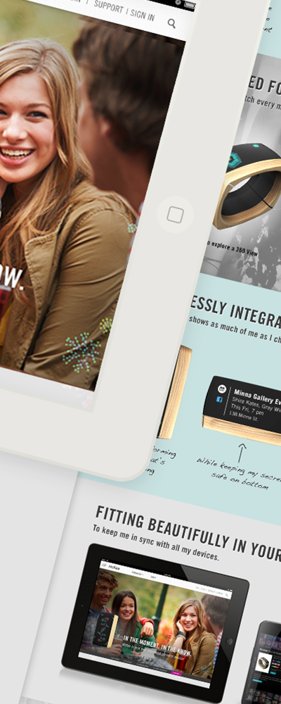
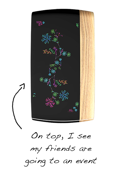
After defining archetypes and opportunities from the visual branding perspective, the VP of Product and I put our heads together to unfold a new vision on Kindara and the direction was clean, modern and easy to use. And decidedly un-girly. Beautiful iconography, new colors that were fresh and inviting, bold lines that created a linear pathway for the users eye and, and a treatment for photography and images that would update their image and make the user fall in love with their product all over again.
Check out more about Kindara on The Guardian, TechCruch, Business Insider and Boston Business Journal.